
 日本語
日本語 Vietnamese
Data Visualization with Python Dash

Introduction to Dash
Dash is an open source library released under the permissive MIT license. Written on top of Plotly.js and React.js, Dash is ideal for building and deploying data apps with customized user interfaces. Dash is simple enough that you can bind a user interface to your code in less than 10 minutes. Dash apps are rendered in the web browser, so it can run on cross-platform and also mobile devices.
Dash tutorial
Dash Installation
Requires the computer to have Python 3 installed.
In the terminal run the following command to install Dash:
pip install dash
With the above command, in addition to dash, pip will also install the graphing support library that is Plotly.
And finally we need to install the Pandas library with the command:
pip install pandas
About Pandas
Pandas is an open source library released under the permissive BSD license. Pandas provides high-performance, easy-to-use data structures and data analysis tools for the Python programming language.
Pandas provides two main data structures, DataFrame and Series. A DataFrame is a 2D data structure that can store data of different types (including characters, integers, floating point values, categorical data and more) in columns. Each column in a DataFrame is a Series.
There are three common conventions for storing column-oriented data:
-
- Long-form data has one row per observation, and one column per variable. This is suitable for storing and displaying multivariate data i.e. with dimension greater than 2.
-
- Wide-form data has one row per value of one of the first variable, and one column per value of the second variable. This is suitable for storing and displaying 2D data.
-
- Mixed-form data is a hybrid of long-form and wide-form data.
Dash Layout
Dash apps are composed of two parts. The first part is the “layout” of the app and it describes what the application looks like. The second part describes the interactivity of the application, it’s “callbacks”.
“Layout” is composed of a tree of “components“.
Dash provides many types of components: Dash HTML Components, Dash Core Components, Dash DataTable, Dash DAQ, Dash Bootstrap Components,…
In this article we use: Dash HTML Components and Dash Core Components.
Dash HTML Components
A function that provides HTML-style components, used to define HTML tags for layouts.
To use Dash HTML Components we need to import to our .py file as follows: from dash import html
Example:
html_demo.py
import dash
from dash import html

app = dash.Dash(__name__)

app.layout = html.Div(children=[
   html.H1(children='Hello Dash'),
])

if __name__ == '__main__':
   app.run_server(debug=True)
html.H1(children='Hello Dash') component generates a <h1>Hello Dash</h1> on the browser.
Just like HTML tags, we can completely change the style of html_component with the “style” property.
Example: html.H1('Hello Dash', style={'textAlign': 'center', 'color': '#7FDBFF'})
The above code is rendered as <h1 style="text-align: center; color: #7FDBFF">Hello Dash</h1>.
There are a few important differences between the Dash HTML Components and the HTML attributes:
- The style property in HTML is a semicolon-separated string. In Dash, you can just supply a dictionary.
- The keys in the style dictionary are camelCased. So, instead of “text-align“, it’s “textAlign“.
- The HTML “class” attribute is “className” in Dash.
- The children of the HTML tag is specified through the “children” keyword argument.
In addition, instead of using the style directly, we can use the CSS file to define the style for the layout, for details, refer to: https://dash.plotly.com/external-resources
You can view all of the available components in the Dash HTML Components Gallery: https://dash.plotly.com/dash-html-components
Dash Core Components
Includes a set of higher-level components like dropdowns, checkboxes, radio items, graphs, and more. You can view all of the available components in the Dash Core Components Gallery: https://dash.plotly.com/dash-core-components
To use Dash Core Components we need to import to our .py file as follows: from dash import dcc
Among core components, “Graph” is an important component for Data Visualization. “Graph” renders interactive data visualizations using the open source plotly.js graphing library. Plotly.js supports over 35 chart types and renders charts in both vector-quality SVG and high-performance WebGL. A small note here is that Plotly.js is only used to render to the browser (this is done by Dash), but when coding we will use the Plotly.py library (provided when installing Dash) rather than coding with javascript.
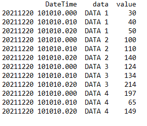
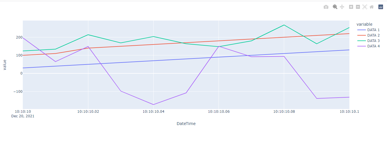
To see how to use the “Graph” component let’s go to an example that displays the csv data to the browser as a line graph.
csv/graph_sample.csv
DateTime,DATA 1,DATA 2,DATA 3,DATA 4
20211220 101010.000,30,100,124,197
20211220 101010.010,40,110,134,65
20211220 101010.020,50,140,214,149
20211220 101010.030,60,150,169,-98
20211220 101010.040,70,160,204,-173
20211220 101010.050,80,170,164,-108
20211220 101010.060,90,180,148,150
20211220 101010.070,100,190,180,92
20211220 101010.080,110,200,268,94
20211220 101010.090,120,210,164,-139
20211220 101010.100,130,220,254,-132
First we need to use pandas to load the csv file
df = pd.read_csv('csv/graph_sample.csv')
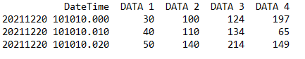
Print the variable df to the console to see its structure
print(df)
Does this look familiar to you? Exactly, it is the wide-form DataFrame that we mentioned in the About Pandas above!
The next step is to convert the DateTime column’s data from string to datetime so that our chart shows the exact date and time of the data.
df['DateTime'] = pd.to_datetime(df['DateTime'], format='%Y%m%d %H:%M:%S.%f')
Now we create a line figure using plotly express
line_fig = px.line(df, x='DateTime', y=['DATA 1', 'DATA 2', 'DATA 3', 'DATA 4'])
Pass the figure to the Graph component
app.layout = html.Div(children=[
    dcc.Graph(id='graph', figure=line_fig)
])
Completed code:
graph_demo.py
import dash
import pandas as pd
import plotly.express as px
from dash import dcc
from dash import html

app = dash.Dash(__name__)

df = pd.read_csv('csv/graph_sample.csv')
print(df)
df['DateTime'] = pd.to_datetime(df['DateTime'], format='%Y%m%d %H:%M:%S.%f')

line_fig = px.line(df, x='DateTime', y=['DATA 1', 'DATA 2', 'DATA 3', 'DATA 4'])

app.layout = html.Div(children=[
   dcc.Graph(id='graph', figure=line_fig)
])

if __name__ == '__main__':
   app.run_server(debug=True)
In the terminal run the command:
python graph_demo.py
Then visit http://127.0.0.1:8050/ to see the result
In the example above:
- Pandas library is used to process input data (read csv, convert data of DateTime column from string to datetime).
- Plotly Express (in the Plotly.py library) is responsible for specifying the graph type (line, scatter,…), x-axis, y-axis,… of the Graph output.
Dash Callbacks
Callback functions: functions that are automatically called by Dash whenever an input component’s property changes, in order to update some property in another component (the output).
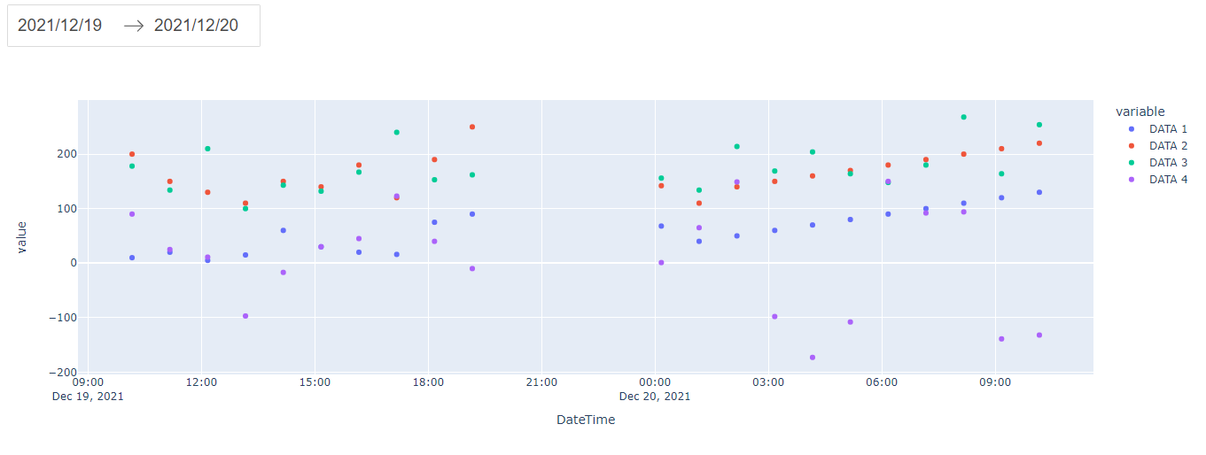
To understand Callbacks let’s come up with an example of filtering data by date, with input from the dcc.DatePickerRange component:
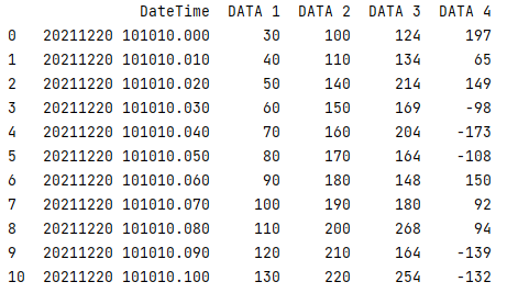
csv/callbacks_sample.csv
DateTime,DATA 1,DATA 2,DATA 3,DATA 4
20211219 101010.010,10,200,178,90
20211219 111010.020,20,150,134,25
20211219 121010.030,5,130,210,11
20211219 131010.040,15,110,100,-97
20211219 141010.050,60,150,143,-17
20211219 151010.060,30,140,132,30
20211219 161010.070,20,180,167,45
20211219 171010.080,16,120,240,123
20211219 181010.090,75,190,153,40
20211219 191010.100,90,250,162,-10
20211220 001010.000,68,142,156,1
20211220 011010.010,40,110,134,65
20211220 021010.020,50,140,214,149
20211220 031010.030,60,150,169,-98
20211220 041010.040,70,160,204,-173
20211220 051010.050,80,170,164,-108
20211220 061010.060,90,180,148,150
20211220 071010.070,100,190,180,92
20211220 081010.080,110,200,268,94
20211220 091010.090,120,210,164,-139
20211220 101010.100,130,220,254,-132
20211221 001010.000,10,90,142,30
20211221 011010.010,30,100,162,55
20211221 021010.020,80,120,180,20
20211221 031010.030,70,110,176,-10
20211221 041010.040,50,130,194,-90
20211221 051010.050,60,140,202,-120
20211221 061010.060,90,150,164,100
20211221 071010.070,120,160,197,132
20211221 081010.080,110,170,186,40
20211221 091010.090,130,210,182,-130
20211221 101010.100,120,230,210,-100
callbacks_demo.py
from datetime import datetime, timedelta

import dash
import pandas as pd
import plotly.express as px
from dash import dcc, Output, Input
from dash import html

app = dash.Dash(__name__)

df = pd.read_csv('csv/callbacks_sample.csv')
df['DateTime'] = pd.to_datetime(df['DateTime'], format='%Y%m%d %H:%M:%S.%f')

init_start_date = df['DateTime'].min().strftime('%Y-%m-%d')
init_end_date = df['DateTime'].max().strftime('%Y-%m-%d')

app.layout = html.Div(children=[
   dcc.DatePickerRange(
       id='date-picker-range',
       start_date=init_start_date,
       end_date=init_end_date,
       minimum_nights=0,
       display_format='YYYY/MM/DD'
   ),
   dcc.Graph(id='scatter-graph'),
])


@app.callback(
   Output('scatter-graph', 'figure'),
   Input('date-picker-range', 'start_date'),
   Input('date-picker-range', 'end_date')
)
def update_figure(start_date, end_date):
   if start_date is not None and end_date is not None:
       start_date = datetime.fromisoformat(start_date)
       end_date = datetime.fromisoformat(end_date) + timedelta(days=1)
       filtered_df = df[(start_date <= df['DateTime']) & (df['DateTime'] <= end_date)]
       scatter_fig = px.scatter(filtered_df, x='DateTime', y=['DATA 1', 'DATA 2', 'DATA 3', 'DATA 4'])

       return scatter_fig


if __name__ == '__main__':
   app.run_server(debug=True)
In Dash, the inputs and outputs of our application are simply the properties of a particular component. In this example, our input are the “start_date” and “end_date” properties of the component that has the ID “date-picker-range“. Our output is the “figure” property of the component with the ID “scatter-graph“.
Whenever an input property changes, the function that the @callback decorator wraps will get called automatically. Dash provides this callback function with the new value of the input property as its argument (in the above example function update_figure has 2 arguments: start_date, end_date), and Dash updates the property of the output component with whatever was returned by the function (in the example above function update_figure returns scatter_fig).
In the terminal run the command python callbacks_demo.py and go to http://127.0.0.1:8050/ to see the result
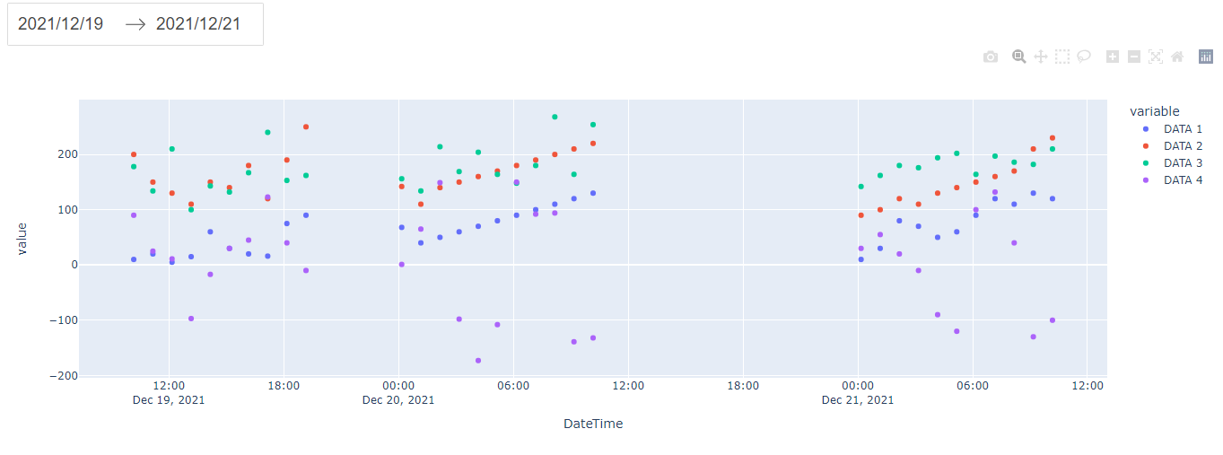
After changing end_date
Optimizing and adding functionality
In this part, we take the code in the Callbacks section to optimize and add functionality to it.
Read n DATA
Currently we are hard-setting the number of input data is 4.
scatter_fig = px.scatter(filtered_df, x='DateTime', y=['DATA 1', 'DATA 2', 'DATA 3', 'DATA 4'])
Assuming we have any amount of data DATA 1, DATA 2, …, DATA n, with the above code we can only read and display 4 data.
To read and display the graph n DATA, we need to modify the code a little bit:
# get first columns name for x-axis
x_col_name = df.columns[0]
# get list column name except first column for y-axis
y_col_name_list = df.columns[1:]
filtered_df = df[(start_date <= df[x_col_name]) & (df[x_col_name] <= end_date)]
scatter_fig = px.scatter(filtered_df, x=x_col_name, y=y_col_name_list)
Read config from CSV header
Consider the header of the CSV as follows
DateTime(yyyyMMdd HH:mm:ss.fff),DATA 1(minFilter=20;maxFilter=100),DATA 2(maxFilter=140),DATA 3,DATA 4,DATA 5
We will add the function to read the config from the header above:
- Read the config of the DateTime column to set the date time format (currently set hard in the code).
- Read config minFilter, maxFilter of DATA columns to filter out data with values less than minFilter and greater than maxFilter of that DATA column.
First add the file utils.py containing common functions
import re

_format_convertor = (
   ('yyyy', '%Y'), ('yyy', '%Y'), ('yy', '%y'), ('y', '%y'),
   ('MMMM', '%B'), ('MMM', '%b'), ('MM', '%m'), ('M', '%m'),
   ('dddd', '%A'), ('ddd', '%a'), ('dd', '%d'), ('d', '%d'),
   ('HH', '%H'), ('H', '%H'), ('hh', '%I'), ('h', '%I'),
   ('mm', '%M'), ('m', '%M'),
   ('ss', '%S'), ('s', '%S'),
   ('tt', '%p'), ('t', '%p'),
   ('fff', '%f'),
   ('zzz', '%z'), ('zz', '%z'), ('z', '%z'),
)


def convert_py_datetime_format(in_format):
   out_format = ''
   while in_format:
       if in_format[0] == "'":
           apos = in_format.find("'", 1)
           if apos == -1:
               apos = len(in_format)
           out_format += in_format[1:apos].replace('%', '%%')
           in_format = in_format[apos + 1:]
       elif in_format[0] == '\\':
           out_format += in_format[1:2].replace('%', '%%')
           in_format = in_format[2:]
       else:
           for intok, outtok in _format_convertor:
               if in_format.startswith(intok):
                   out_format += outtok
                   in_format = in_format[len(intok):]
                   break
           else:
               out_format += in_format[0].replace('%', '%%')
               in_format = in_format[1:]
   return out_format


def extract_csv_col_config(col_name: str):
   try:
       found = re.search('\\((.*)\\)', col_name)
       col_name = col_name.replace(found.group(0), '')
       config_string = found.group(1)
       config_list = config_string.split(';')
       configs = []
       for config in config_list:
           key_value_list = config.split('=')
           key = key_value_list[0]
           value = key_value_list[1] if len(key_value_list) > 1 else None
           configs.append((key, value))
   except AttributeError:
       configs = []
   return col_name, configs
In the above code:
-
- The convert_py_datetime_format function is used to convert the format of yyyyMMdd HH:mm:ss.fff to the Python format.
- The extract_csv_col_config function will take the name of the column containing the config and return the column name that has removed the config string along with an array containing the configs of that column. For example
DATA 1(minFilter=20;maxFilter=100)will returnDATA 1and array[(minFilter, 20), (maxFilter, 100)]
Next add function process_csv_variable to app.py
from datetime import datetime, timedelta

import dash
import numpy as np
import pandas as pd
import plotly.express as px
from dash import dcc, Output, Input
from dash import html

from utils import extract_csv_col_config, convert_py_datetime_format


def process_csv_variable(df_param):
   # process x-axis csv variable
   old_x_col_name = df_param.columns[0]
   new_x_col_name, configs = extract_csv_col_config(old_x_col_name)
   datetime_format = configs[0][0]
   df_param = df_param.rename(columns={old_x_col_name: new_x_col_name})
   df_param[new_x_col_name] = pd.to_datetime(df_param[new_x_col_name],
                                             format=convert_py_datetime_format(datetime_format))
   # process y-axis csv variable
   y_col_name_list = df_param.columns[1:]
   for old_y_col_name in y_col_name_list:
       new_y_col_name, configs = extract_csv_col_config(old_y_col_name)
       df_param = df_param.rename(columns={old_y_col_name: new_y_col_name})
       for config, value in configs:
           if config == 'minFilter':
               df_param.loc[df_param[new_y_col_name] < int(value), new_y_col_name] = np.nan
           elif config == 'maxFilter':
               df_param.loc[df_param[new_y_col_name] > int(value), new_y_col_name] = np.nan
   return df_param


app = dash.Dash(__name__)

app.layout = html.Div(id='container', children=[
   dcc.DatePickerRange(
       id='date-picker-range',
       minimum_nights=0,
       display_format='YYYY/MM/DD'
   ),
   dcc.Graph(id='scatter-graph'),
])


@app.callback(
   Output('date-picker-range', 'start_date'),
   Output('date-picker-range', 'end_date'),
   Input('container', 'id')
)
def update_date_picker(id):
   df = pd.read_csv('csv/app_sample.csv')
   df = process_csv_variable(df)
   x_col_name = df.columns[0]

   init_start_date = df[x_col_name].min().strftime('%Y-%m-%d')
   init_end_date = df[x_col_name].max().strftime('%Y-%m-%d')
   return init_start_date, init_end_date


@app.callback(
   Output('scatter-graph', 'figure'),
   Input('date-picker-range', 'start_date'),
   Input('date-picker-range', 'end_date')
)
def update_figure(start_date, end_date):
   df = pd.read_csv('csv/app_sample.csv')
   df = process_csv_variable(df)
   if start_date is not None and end_date is not None:
       start_date = datetime.fromisoformat(start_date)
       end_date = datetime.fromisoformat(end_date) + timedelta(days=1)
       # get first columns name for x-axis
       x_col_name = df.columns[0]
       # get list column name except first column for y-axis
       y_col_name_list = df.columns[1:]
       filtered_df = df[(start_date <= df[x_col_name]) & (df[x_col_name] <= end_date)]
       scatter_fig = px.scatter(filtered_df, x=x_col_name, y=y_col_name_list)

       return scatter_fig


if __name__ == '__main__':
   app.run_server(debug=True)
The function process_csv_variable will receive a DataFrame, read the config from the column names, process the data according to the config, and return a DataFrame after processing.
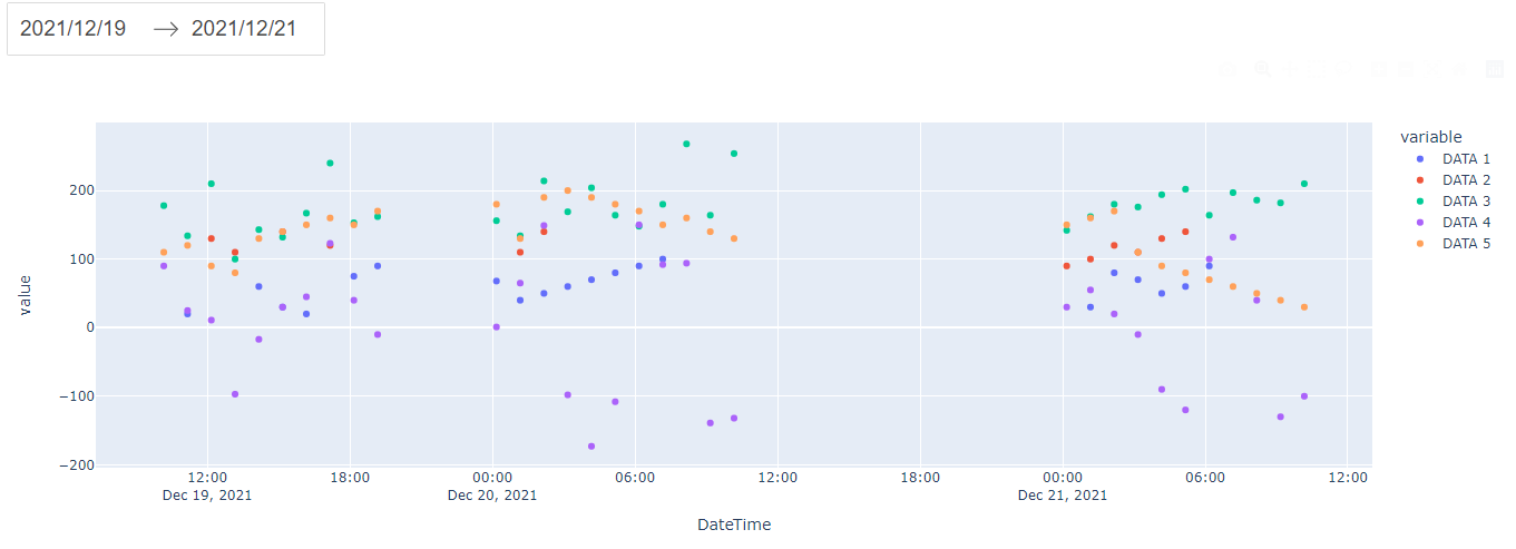
Now we add csv/app_sample.csv file to test
DateTime(yyyyMMdd HH:mm:ss.fff),DATA 1(minFilter=20;maxFilter=100),DATA 2(maxFilter=140),DATA 3,DATA 4,DATA 5
20211219 101010.010,10,200,178,90,110
20211219 111010.020,20,150,134,25,120
20211219 121010.030,5,130,210,11,90
20211219 131010.040,15,110,100,-97,80
20211219 141010.050,60,150,143,-17,130
20211219 151010.060,30,140,132,30,140
20211219 161010.070,20,180,167,45,150
20211219 171010.080,16,120,240,123,160
20211219 181010.090,75,190,153,40,150
20211219 191010.100,90,250,162,-10,170
20211220 001010.000,68,142,156,1,180
20211220 011010.010,40,110,134,65,130
20211220 021010.020,50,140,214,149,190
20211220 031010.030,60,150,169,-98,200
20211220 041010.040,70,160,204,-173,190
20211220 051010.050,80,170,164,-108,180
20211220 061010.060,90,180,148,150,170
20211220 071010.070,100,190,180,92,150
20211220 081010.080,110,200,268,94,160
20211220 091010.090,120,210,164,-139,140
20211220 101010.100,130,220,254,-132,130
20211221 001010.000,10,90,142,30,150
20211221 011010.010,30,100,162,55,160
20211221 021010.020,80,120,180,20,170
20211221 031010.030,70,110,176,-10,110
20211221 041010.040,50,130,194,-90,90
20211221 051010.050,60,140,202,-120,80
20211221 061010.060,90,150,164,100,70
20211221 071010.070,120,160,197,132,60
20211221 081010.080,110,170,186,40,50
20211221 091010.090,130,210,182,-130,40
20211221 101010.100,120,230,210,-100,30
In the terminal run the command python app.py and visit http://127.0.0.1:8050/ to see the result
To make it easier to check the results, we hide the other data and only show DATA 1
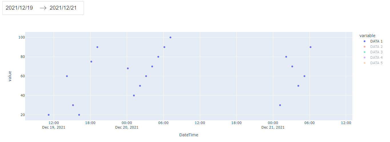
We see that data with values less than 20 and greater than 100 has been filtered out.
Source code
https://gitlab.com/bwv-hp/python-dash-sample